The Role Colour and Design Play in Branding
If your firm needs to develop its brand, either from scratch because you are a start-up or to reinvigorate your fortunes by creating a new image, it is important to understand what design and colour can and cannot do.
Firstly, it needs to be understood that branding is not just about the logo. Building a brand is about creating a distinctive identity in many ways. This can be reflected in your company name, but it is also about creating perceptions.
This can be based on your unique selling points, your position in the market and how it sets out to appeal to a particular buyer persona to bring in custom. It is about finding a position in the market and working out which words to use in outlining and expressing what you have to offer.
All this is designed to create an image that is memorable and distinct, the thing that sticks in people’s minds and is the thing they will say about your company if it is mentioned in conversation.
This is a lot to consider, but it is very important in building a brand and it is crucial to understand that any colours, logo or livery design cannot be a shortcut or substitute for the array of elements involved in creating a clear brand identity and image. Rather, this is the final touch that brings it all together.
Because of this, the colours and logo should be defined by what you want the brand to be, not the other way round.
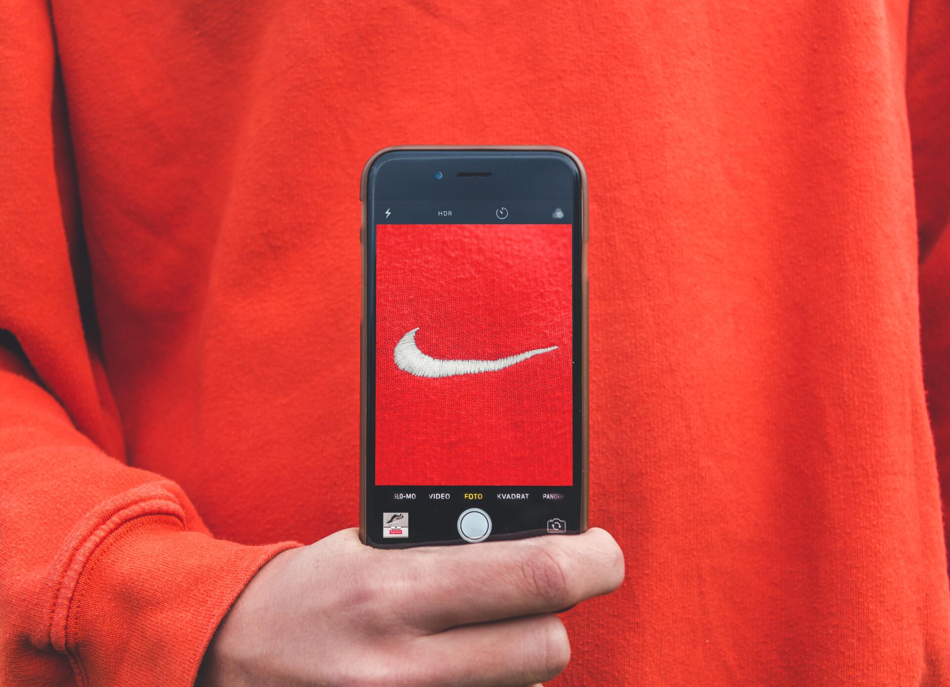
Once you reach this stage, the next key point is to consider all the elements branding design involves. A distinctive logo can certainly be an important part of the process. Many brand logos are extremely familiar, such as the Nike swoosh or the McDonald’s golden arches.
Whatever your logo looks like, you will need the design to be sufficiently different to avoid it being mistaken for someone else’s. This is partly because a lack of a distinctive logo will make it harder to identify it as belonging to your firm, but also because too much similarity may create trademark issues.
The colour you choose is also significant. It is well known by designers in various fields that different colours can help generate certain moods , such as a calming feeling for green or blue, while red is associated with excitement and yellow with warmth. This means your choice of colour could depend on what your product or service is.
In some cases, the answer is obvious; if you sell eco-friendly products, green is the go-to colour. If you want to build trust over time, blue is a strong option.
Of course, there are exceptions, but they are not random. For example, purple is often seen as a colour of royalty or spirituality, which might make it an odd colour for an online estate agency like Purple Bricks. But in that case, the colour is tied in with the title, strengthening the identity. Other examples of this include the mobile phone company Orange.
Getting the right logo and colours is not easy and understanding how it fits with a wider branding strategy is no simple task either. That’s why it always pays to bring in the experts who can help you devise a brand that communicates clearly what you are about and what you can offer.
Need to boost your brand? Then contact the best branding agency in Buckinghamshire.